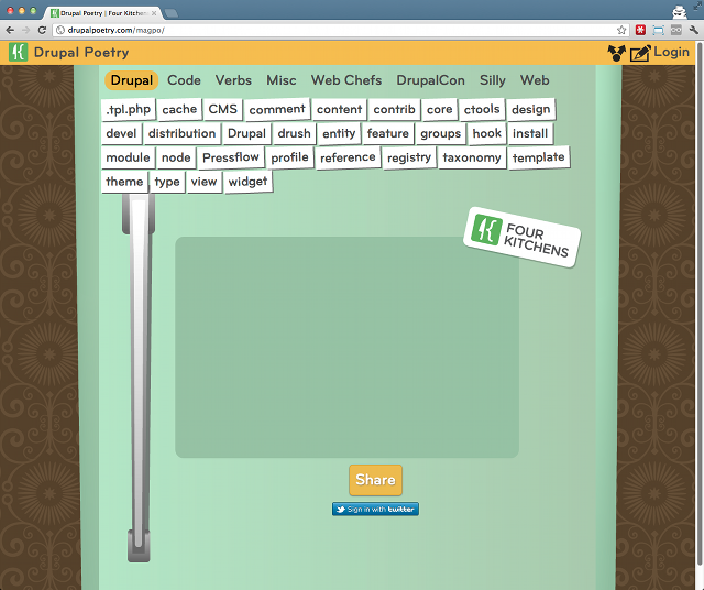
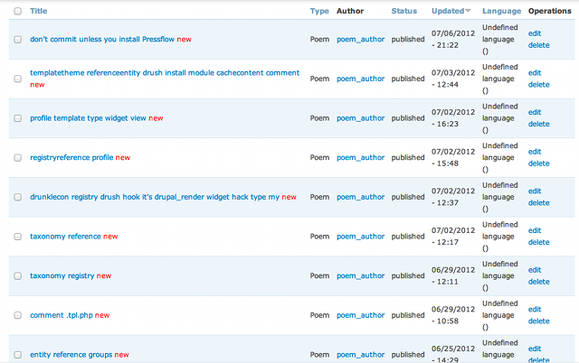
Drupal Poetry
Responsive Application Development with Drupal and Backbone
Elliott Foster
Michal Minecki
mm
Drupal Poetry
One codebase to rule them all.Desktop
Tablet
Mobile
Drupal Admin
ef
What We'll go over
- Technologies we used & how they work together.
- Differences between responsive websites & responsive applications.
- Some fun JS tricks.
- Some things we got wrong, and what we're doing differently next time.
- How we integrated Drupal.
Why We Built it
- Have fun. (Built on 20% time)
- Work with hipster technolgies.
- See if Responsive works for Applications.
ef
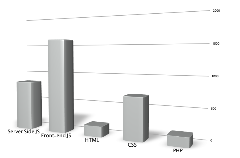
Technologies
mm
Front-end JS:
Backbone.js and Underscore
- Backbone
- Lightweight framework for creating web applications
- Almost a MVC
- Underscore
- Set of utility functions that make working with JavaScript less insane.
Backbone.js and Underscore
- Backbone
- Lightweight framework for creating web applications
- Almost a MVC
- Underscore
- Set of utility functions that make working with JavaScript less insane.
ef
require.js
- requirejs.org
- JavaScript file and module loader.
- Simplifies code reuse on client and server.
- Includes build/optimization tools.
ef
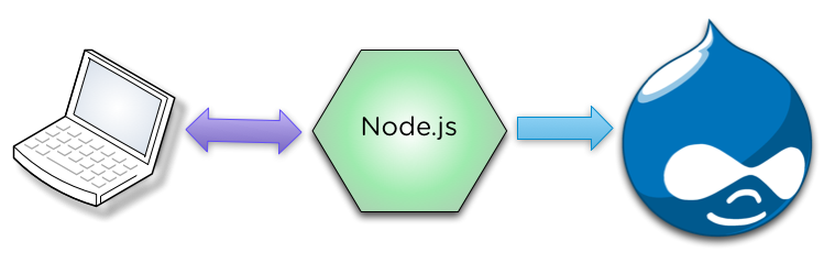
Node.js
- nodejs.org
- Server side JavaScript platform.
- Built on Google Chrome's V8 JavaScript engine.
- Event-driven, non-blocking.
ef
MongoDB
- mongodb.org
- NoSQL database/document store.
- Objects stored in BSON (very similar to JSON).
- Schemaless design.
mm
Drupal
- drupal.org
- Fully baked administration workflow
- Easy to connect to using services module
- Lots of stuff "out of the box"
- Todd said we had to
ef+mm
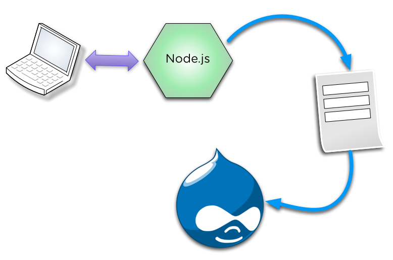
Architecture
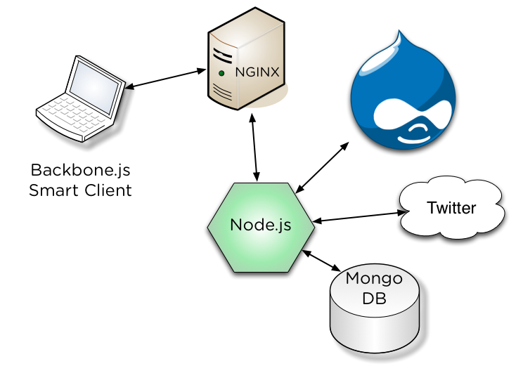
Poem life cycle
ef
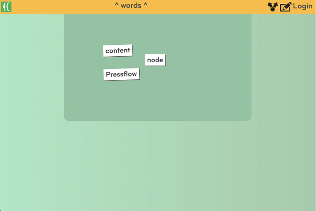
Fresh Page
- Nginx serves the HTML.
- Backbone.js requests the cached taxonomy terms to populate the word libraries.
- User starts to put words in the work area.
- All changes are stored in the browser memory.
- User clicks share.
mm
Saving a Poem
- Poem is saved.
- If there is no Session: Session is lazy created by Node.js and stored in Browser Local storage.
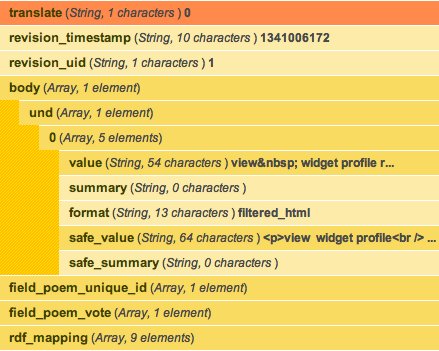
- Poem is saved as a json object directly in MongoDB by Node.js.
- Permalink is created by Node.js from the MongoDB hash and sent to browser.
- Reference to Poem is asynchronously saved in Drupal using services. (Send some other data with it but we feel bad about that.)
- Drupal responds with NID.
- Node.js Updates the MongoDB document with the the NID.
ef
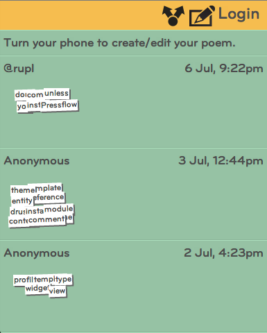
Fun stuff.
- User is encouraged to login with Twitter OAuth and/or tweet it.
- If they don't login and don't clear cache they can come back and edit.
- Now it gets interesting.
- Moving the words saves the new poem in MongoDB. Autosave!
- Same anon user can edit poems without login.
- Users can "fork" poems. Use someone else's poem as a starting point.
questions
Architecture Questions?
Responsive Application Development
vs
Responsive Web Development
mm
Responsive Web
- Send one piece of HTML for all devices.
- Smart client "fits" content to the screen.
- Media Queries a main tool.
- Very well established patterns for content heavy sites.
Examples

Media Query
/* Tablets with a 600px width (in portrait mode) */
@media only screen and (min-width: 600px) and (orientation:portrait) {
  body {
    font-size: 1.575em;
  }
ef
Responsive Applications
- It's new ground, lots more unsolved problems that keep changing.
- Design patterns are not as strongly established for cross device interaction.
- HTML5 is a moving target, lots of promise but can't depend on browser support (test early and often).
- Lack of solid libraries, get ready to write lots of code and solve lots of problems.
- Inconsistent performance on older devices (Samsung Y U NO WORK!?).
Responsive application design requires different interfaces for different screen sizes.
- Content is simpler to scale than interaction.
- Consider which interactions need to be exposed on mobile and add more on larger display sizes.
- Still would recommend staying away from server side device detection.
- Sometimes interaction needs to be degraded and that takes planning.
mm
Design, code, and test mobile first.
Best piece of advice from this whole talk!
- Much easier to build up than to "fit" later.
- It's true for everything from design to code to testing.
- If you are going down this road it's time to stop being scared.
mm
Responsive App Interface Layout is Complicated
- Where does the Nexus 7 fit?
- Difference between tablet orientation is challenging
- You forgot about the twitter browser didn't you.
Responsive App Interface Layout is Complicated
- Modularity is king.
- Allow user to scale and scroll as much as you can.
- Expect the unexpected!
Client Side Templating To the Rescue
- It simplified everything and made the app fast (mostly).
- Made different interfaces possible since the data was separated (but didn't make them easy or seamless).
- Drawback: somewhat slow on shitty tablets.
- If we did it again we'd send rendered HTML for the initial view and then use templating for updates.
ef
CSS Display Dictates JavaScript Behavior
- Don't need to worry about differences in browser JavaScript APIs.
- It's fast!
              (function($) {
                // ...

                var barVisible = $('#word-bar').is(':visible');
                var listingsVisible = $('#listings').is(':visible');

                // ...
              }(jQuery));
ef
Duck Punch, Learn to Love It
- Proxy touch events to mouse events: jQuery-ui touch punch
- touch == click
- resize == orientation change
              (function($) {
                // ...

                var supportsOrientationChange = "onorientationchange" in window;
                var orientationEvent = supportsOrientationChange ? "orientationchange" : "resize";

                // Reset barVisible on orientation changes.
                var dispatch = _.clone(Backbone.Events);
                window.addEventListener(
                  orientationEvent,
                  function() {
                    barVisible = $('#word-bar').is(':visible');
                    listingsVisible = $('#listings').is(':visible');
                    dispatch.trigger('orientationChange');
                  },
                  false
                );

                // ...
              }(jQuery));
Drupal as Content Management not Content Server
ef
Why we didn't build
all of it on Drupal?
- Drupal is too slow for highly interactive apps.
- We wanted to auto save on poem changes.
- We didn't want to deploy to a bunch of servers.
- WSCCI is going to make this much better!
 vs
vs
- We weren't supporting site builders.
- Don't need all the things that Drupal gives you for "free".
- Twitter is a great way to get simple user auth.
mm
Why build with Drupal?
- Who likes building admin interfaces!? Yeah us neither...
- Once you have nodes it's easy to set up aggregate views.
- Services is very easy to extend and work with.
- Administer poem words with Taxonomy <- Win!
ef
Why build with Node.js?
- Data models are JSON objects...
- They work on the client.
- They work on the server.
- They work in MongoDB.
- It's f%@#ing Fast!
- Evented I/O is great for bursty and unpredictable applications.
- All made possible with asynchronous libraries.
Autosave Workflow
ef
Actual
mm
Better